Ye Olden Web Archive
Shrieking Tree’s creative director, Justin Norman, has been making web sites since 1996, and we’ve decided to archive them here with some of his notes. Some of them are still pretty fun to explore if you’ve got a browser that supports Flash animation. Keep in mind, of course, that this work is not indicative of our current design aesthetic, but rather as a record of our evolving work. If you click into some of them we’ve provided links that allow you to access pretty much the entire site. Enjoy.
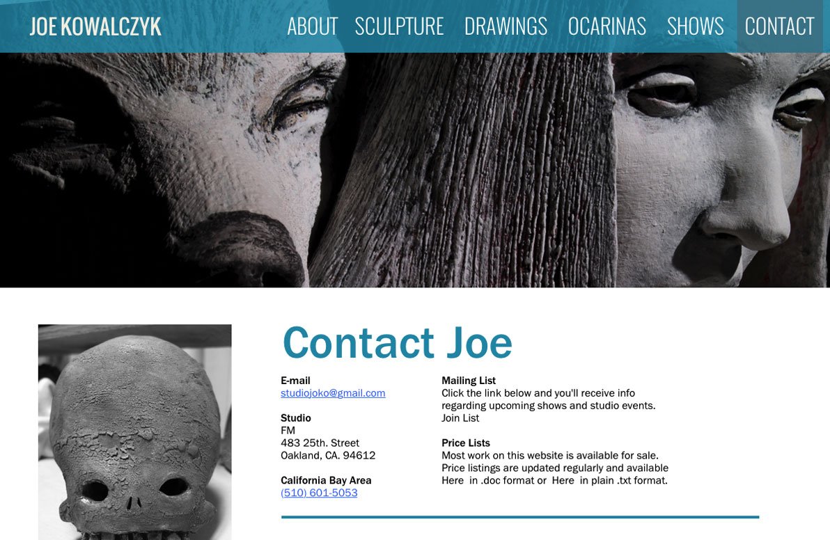
Joe Kowalcyzk
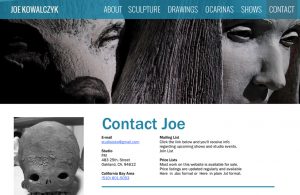
A clean, simple, elegant web site designed for artist/sculptor Joe Kowalcyzk. The top banner changes on each page, highlighting a different creation of his. Since the photographs are all black and white, it gave me the rare opportunity to completely change the color scheme for each page, setting the tone for each area of his work. It’s one of my favorite visual designs.
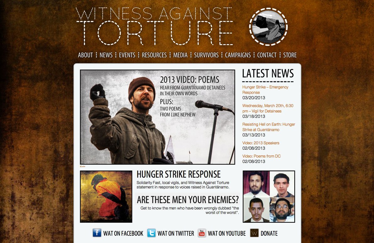
Witness Against Torture v1.0
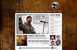
This organization combats what is one of the most unpleasant evils alive in the world today. But though the topic is truly awful, I sought to highlight the beauty of the group’s work through a gritty, orange and black themed site. The home page offers a rotating set of images that spotlight the latest content, and the Resources section provides a visual guide to the ever-expanding catalog of books and films that tackle the issue.

Johnson Law Firm, LLC
One of my favorite designs from the time period where I was very into using natural textures. Red is a difficult color to work with in large quantities, but I think this design turned out quite handsomely.

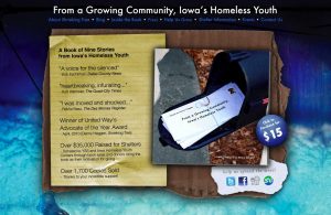
From a Growing Community, Iowa’s Homeless Youth
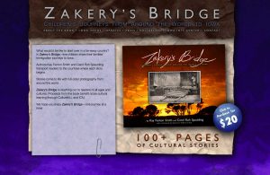
This site, like the book it was built to promote, was designed using real materials I found and photographed — scraps of cardboard, notebook paper, envelopes. It also allowed you to read a few full stories from the book and check out the layout before purchasing. The proceeds were donated to local homeless youth shelters.
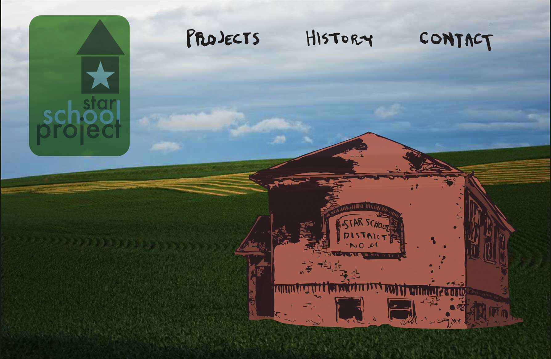
Star School Project
Built back when Flash animation was common, this site gave visitors a look inside an old barn that was turned into an event venue.

Sierra Glass
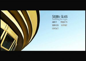
In the mid-2000s I worked at a glass installation company in Las Vegas, estimating costs for projects and drawing blueprints for smaller installations. Every once in awhile I was let loose to do some design and photography work. One of the projects was this web site, for each I walked around the city photography projects the company had done, and crafting a site around the negative space in each photo.
Unwed Sailor
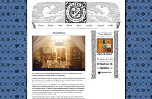
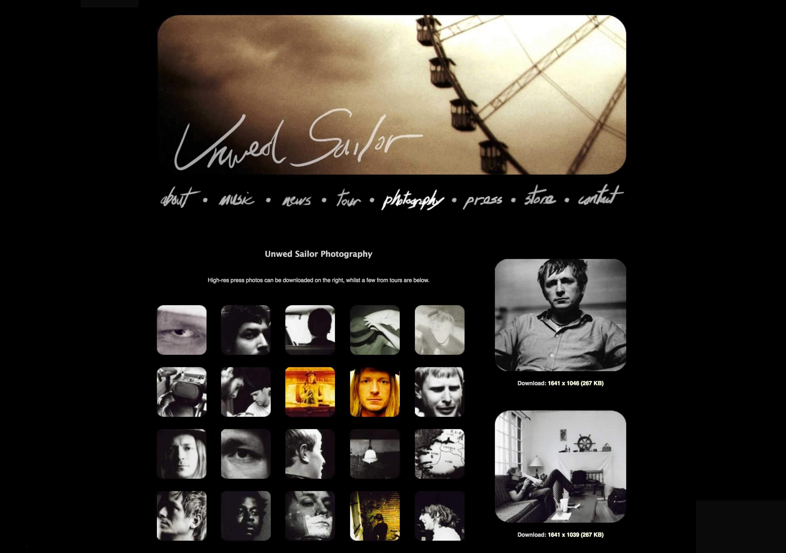
When I was first starting out building web sites, I would contact bands I liked and ask them if they needed any design work done on the cheap. That’s how the site for Unwed Sailor came about. Unwed Sailor was creating some really distinct, impressive instrumental albums that had a sense of optimism and longing that I’d found I connected with more readily than most other bands I was checking out at the time. So I put together a site that centered on the band’s photography and paintings, pairing those visuals with the music whenever I could, often through Flash-animated album players.

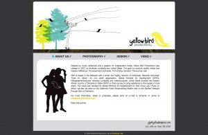
Lightyard Photography
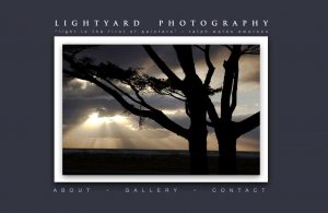
I built this site for a local photographer way back when, focusing on using a lot of negative space to make his work stand out.
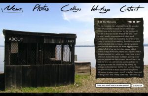
Tracing the Seams
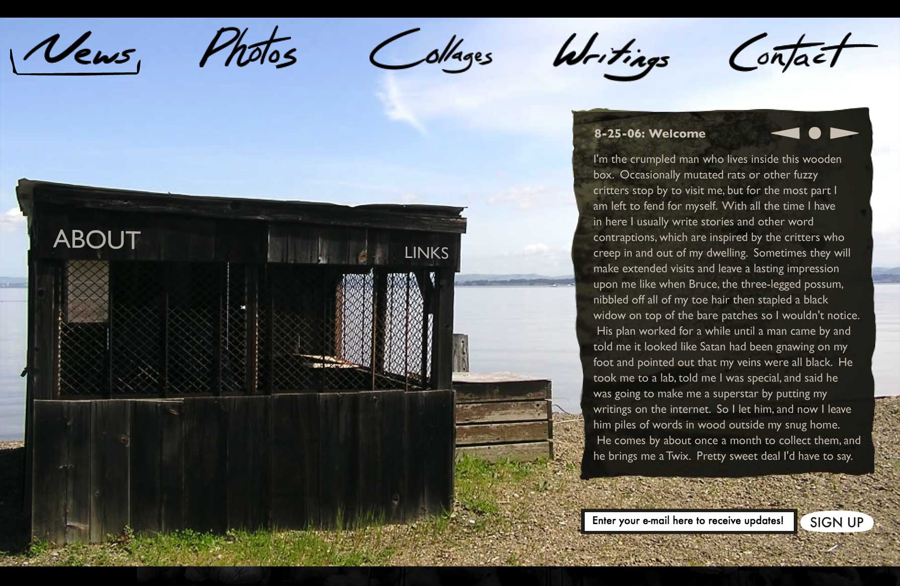
One of my favorite early projects was creating this web site for my brother, Wesley. He’s a photographer and a poet, and wanted a way to creatively present that to the world. So we worked together to make this animated site that designed around photos he’d taken. If you visited the photo gallery, a pelican would fly by and drop the thumbnails into a clickable grid.
Grand Ruin
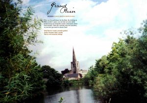
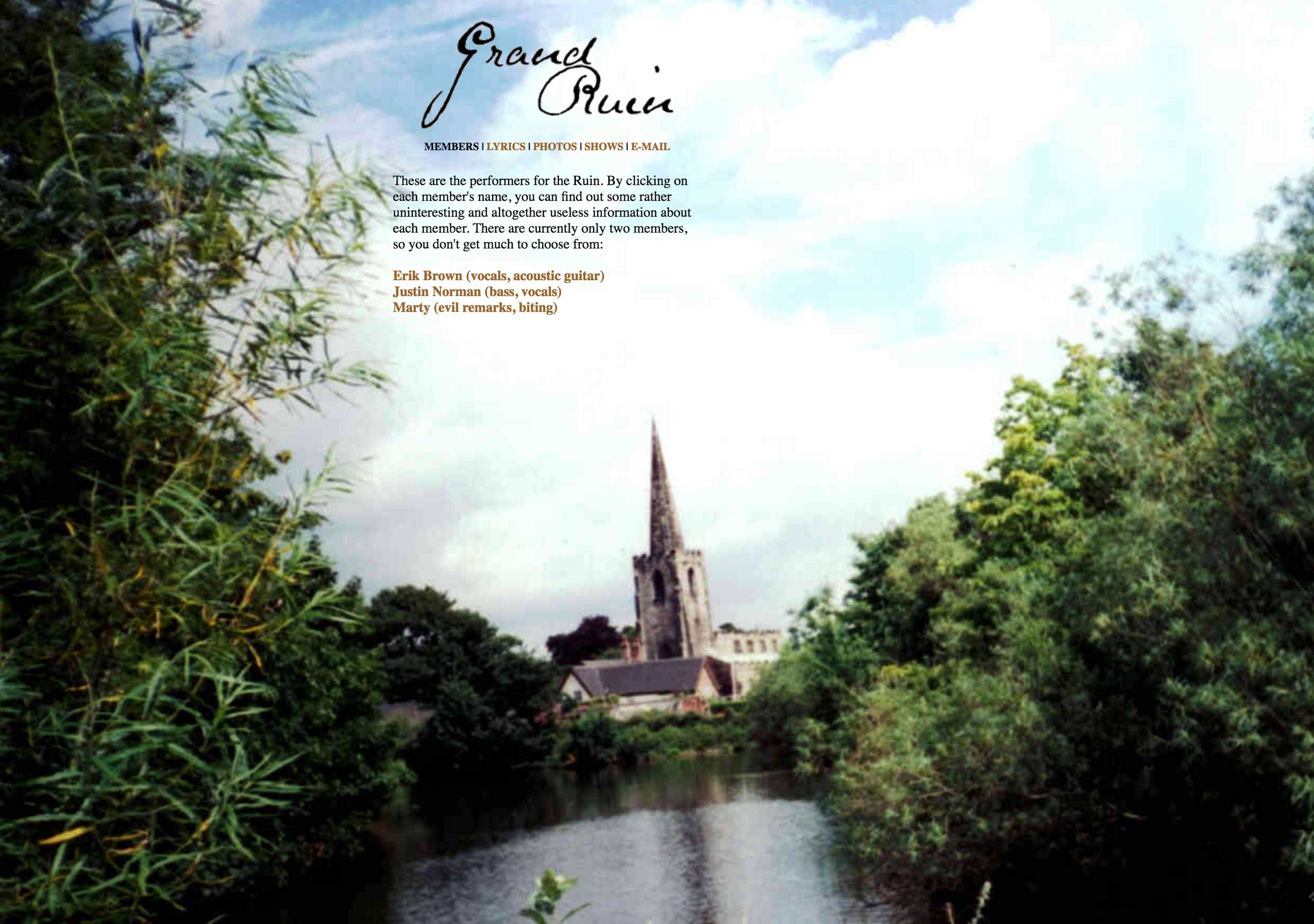
Grand Ruin was the first musical project I worked on with Erik Brown. It mostly amounted to us writing and fiddling around with acoustic songs while living in an apartment in Ames, IA. We never performed live, but we made all the preparations for it. One of them was this site, which was my first experiment with using full-page photography as a frame for text information. Because there was so little text, it more or less worked, though I do regret the ugly font choice.
Cardboard Canary
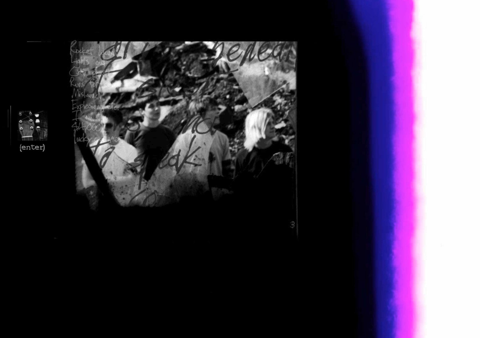
This site, made for my first band, is the first time I achieved some sort of success with visual design. I based the navigation off the layout for my first site, keeping the site locked into a pop-up window with top and bottom frames that remained constant, while the middle changed. The graphics were, for the first time, relatively clean, with most of the navigation buttons based around icons from the Webdings font. It had a chat room that was a pretty fun place to hang out in from time to time, as fans and foes alike would use it, which resulted in a fair amount of heated, irrational battles between angsty teenagers.
I hid a lot of easter eggs in the design, so if certain bits of the logo were clicked, you would get access to unreleased tracks, or a nonsensical short story.

