Joe Kowalcyzk
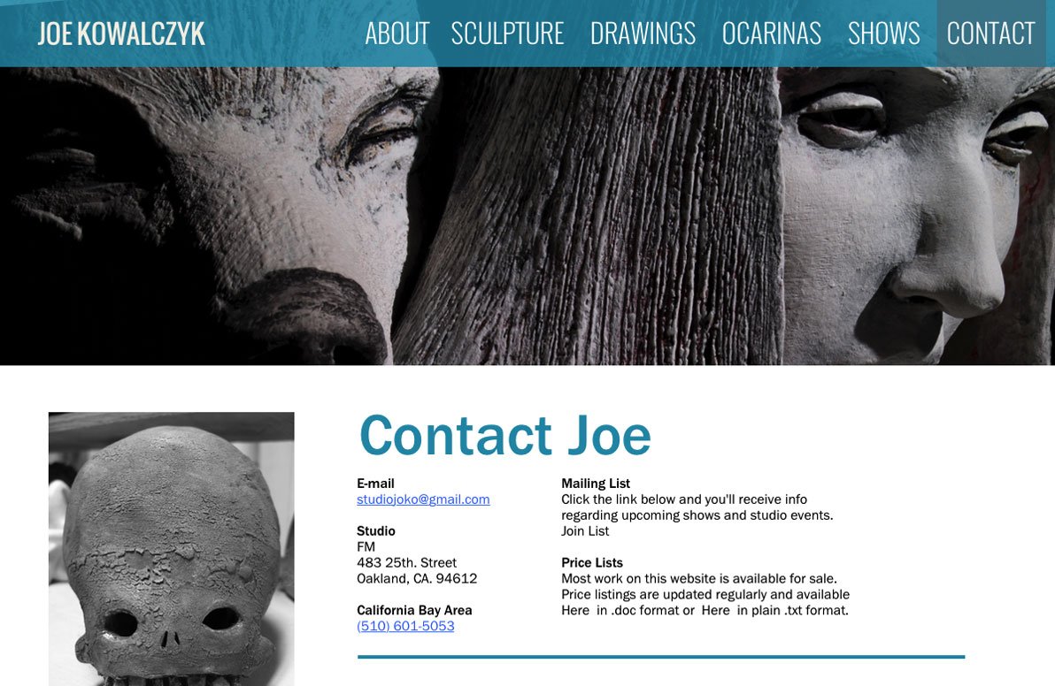
A clean, simple, elegant web site designed for artist/sculptor Joe Kowalcyzk. The top banner changes on each page, highlighting a different creation of his. Since the photographs are all black and white, it gave me the rare opportunity to completely change the color scheme for each page, setting the tone for each area of his work. It’s one of my favorite visual designs.
Features
- Modern, minimal design
- Design heavily showcases artist's work
- Color-changing interface
- Easily user-updatable
- SEO Ready
